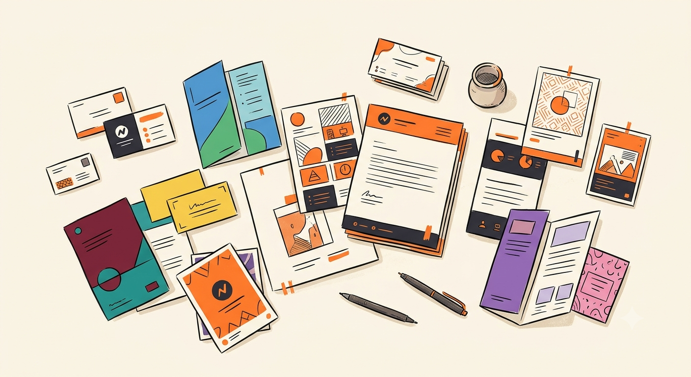
We live in an era where brands pour millions into digital presence — perfecting their Instagram grid, obsessing over website animations, and A/B testing every email subject line. And yet, when it comes to print materials, many of the same brands seem to forget everything they know about consistency.
A business card with the wrong shade of blue. A poster where the logo is 10% too small. A brochure where someone picked "close enough" fonts instead of the exact brand typeface. These aren't minor details — they're trust erosion, one touchpoint at a time.
The Trust Equation: Why Print Hits Different
There's a psychological phenomenon at play here. Digital interactions are fleeting — a website visit lasts seconds, a social ad scrolls past in milliseconds. But print is physical. A business card sits on someone's desk for weeks. A brochure lives in a conference bag. A poster stays on a wall for months.
When that physical artifact is inconsistent with your digital brand, the recipient doesn't consciously think "their blue is 5% off." Instead, something feels wrong. The brand feels less professional, less trustworthy, less established. And that feeling lingers — because the print artifact lingers.
"Your brand is what people say about you when you're not in the room. But your print materials? Those stay in the room long after you've left."
The Real Cost of Inconsistency
According to Lucidpress research, consistent brand presentation across all platforms can increase revenue by up to 23%. Conversely, inconsistency doesn't just look bad — it actively costs money in several ways:
- Reprints & corrections — Wrong CMYK values, incorrect bleed settings, and mismatched fonts result in costly print runs that go straight to recycling.
- Design bottlenecks — Every new print asset becomes a mini-project requiring designer review, brand guide consultation, and multiple revision rounds.
- Lost opportunities — When it takes 2 weeks to get a "simple" event poster approved and printed, teams learn to stop asking — and opportunities are missed.
- Brand dilution — Each inconsistent touchpoint chips away at the precise, professional image you've spent years building.
Where Traditional Workflows Break Down
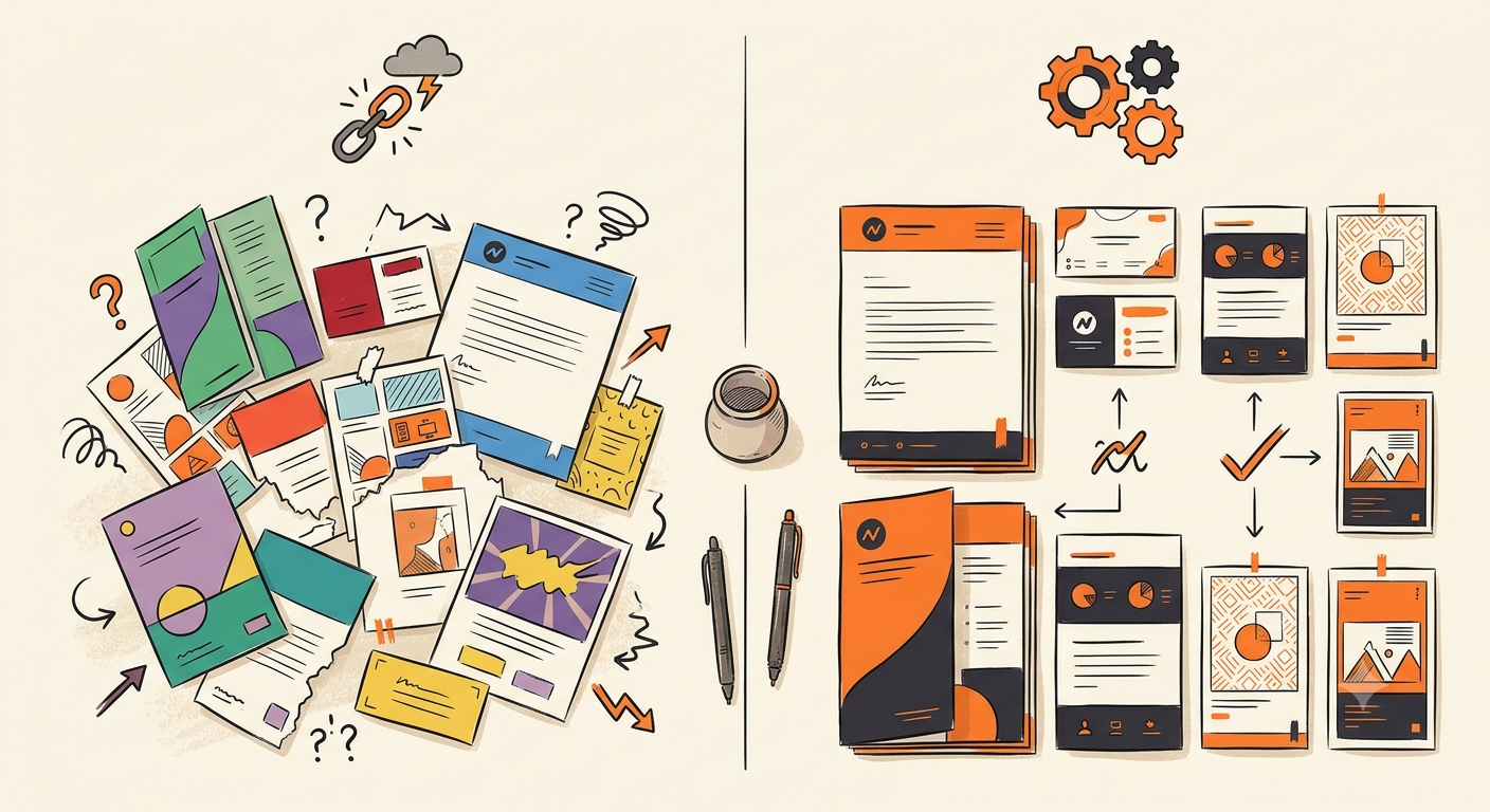
The typical print design workflow looks something like this: a marketer has an idea, submits a brief to a designer (or opens Canva), hunts for the brand style guide, tries to match the exact hex codes (which don't translate directly to CMYK), manually sets up bleed and trim marks, exports, sends for review, gets corrections, re-exports, and finally sends to print.
At every stage, there's a chance for something to go wrong. And the more people involved, the more chances for inconsistency to creep in. Even with the best brand guidelines document, humans make mistakes — especially when they're in a hurry, which is always.
The Case for Architectural Brand Enforcement
Here's the paradigm shift: brand consistency shouldn't be a guideline — it should be a constraint. Not a PDF document that people "should" follow, but a system where deviation is architecturally impossible.
This is exactly the approach that NeuroInkX takes. Instead of trusting humans to pick the right shade of orange (is it #E6712F or #E87232?), the system enforces it. Instead of hoping someone remembers the correct logo clear space, the layout engine calculates it. Instead of manually converting RGB to CMYK and hoping the colors hold, the system handles color profile conversion at the architecture level.
The result? Every single print asset — whether generated by the CEO, an intern, or an AI engine — looks exactly like it should. Not "close enough." Exactly right.
What This Means for Your Team
- Zero design bottleneck — Anyone on your team can produce print-ready assets without design skills or brand guide consultations.
- 100% consistency guaranteed — Not as an aspiration, but as an architectural fact. Wrong fonts, colors, or spacing literally cannot happen.
- Minutes, not weeks — A poster that used to take 5 design iterations and 2 weeks now takes 5 minutes and zero revisions.
- Print-ready from pixel one — CMYK color profiles, bleed settings, crop marks, and correct DPI are all handled automatically.
The Bottom Line
Digital will continue to dominate marketing budgets and attention. But print isn't going away — it's too tangible, too memorable, too trust-building to abandon. The brands that will win aren't the ones choosing between digital and print. They're the ones ensuring every touchpoint, physical or digital, tells exactly the same brand story.
The question isn't whether brand consistency in print matters. It's whether you can afford to leave it to chance — or whether it's time to make it a certainty.